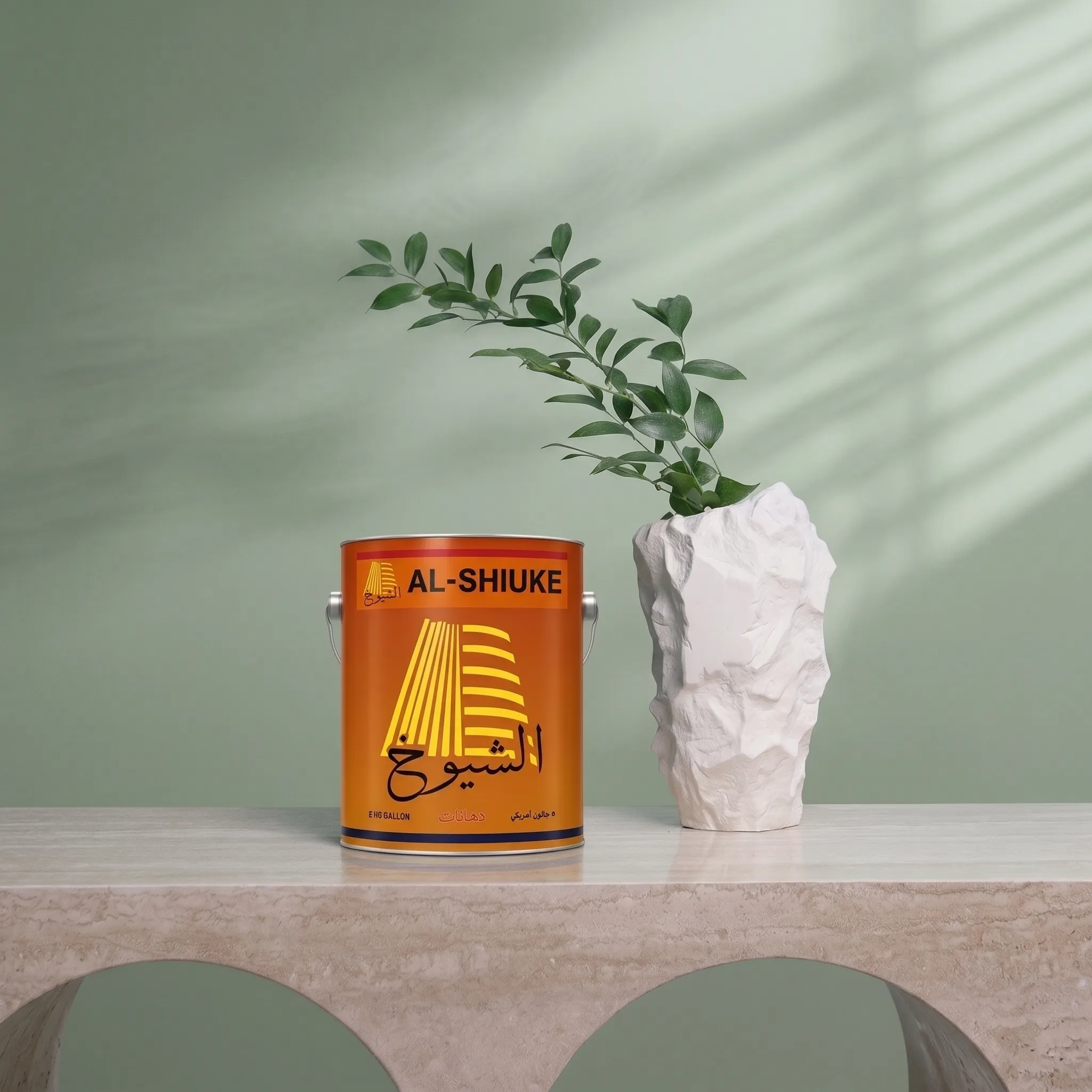



Choosing a paint colour feels simple — until you’re standing in front of fifty shades of “white” wondering why none of them look the same on your wall as they did on the swatch. The truth is, colour isn’t just a visual choice. It’s an emotional one. The right shade can make a room feel calm, energetic, cosy, or spacious. The wrong one can make even a beautifully designed space feel off.
Here’s how to choose a colour you’ll still love long after the paint has dried.
1. Start With How You Want to Feel, Not Just How You Want It to Look
Before browsing colour charts, ask a simpler question: how do you want this room to feel?
- Calm and restful? Soft blues, sage greens, and muted neutrals work beautifully in bedrooms.
- Warm and welcoming? Earthy tones, warm beiges, and terracotta shades bring comfort to living rooms.
- Energetic and social? Bolder colours — mustard, deep teal, or rich burgundy — work well in dining areas or kitchens.
Colour psychology matters more than most people realise. The mood of a room often comes from its undertone before it comes from its furniture.
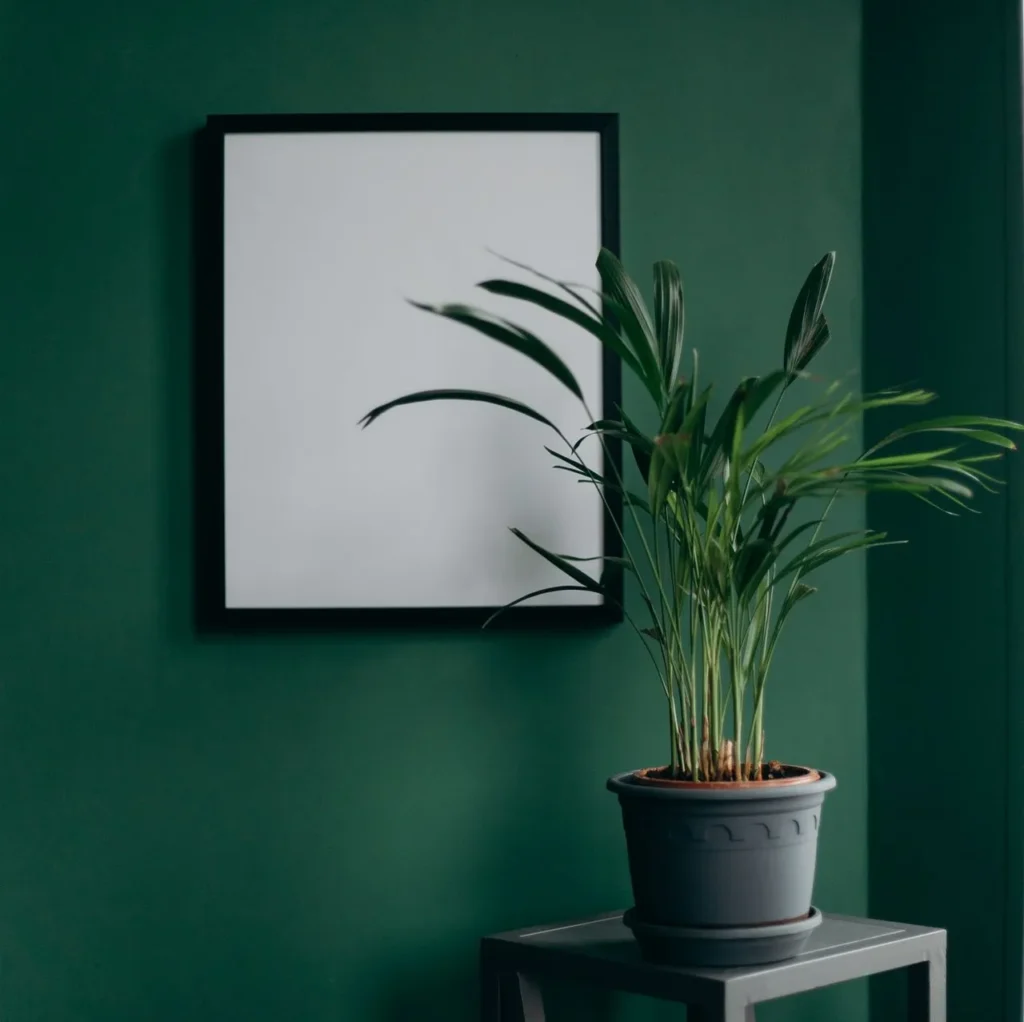
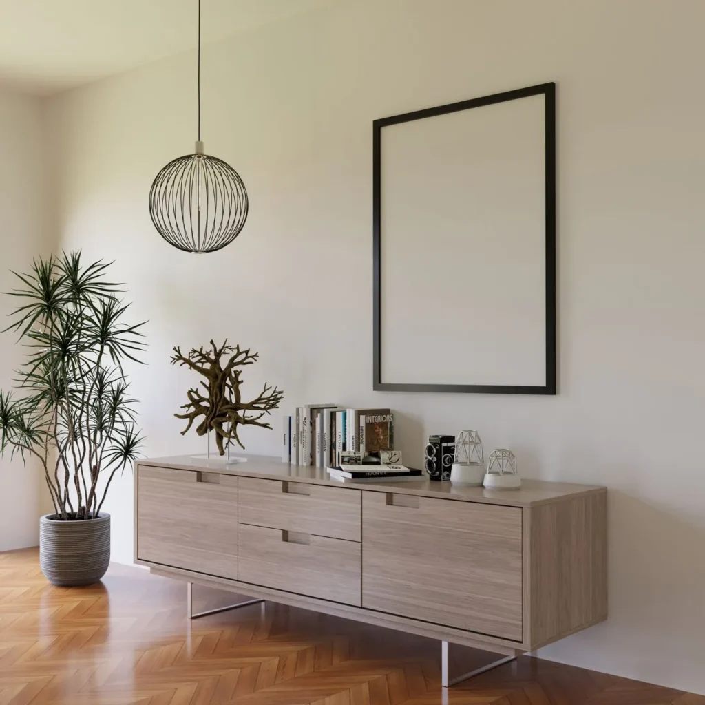
2. Always Test on the Actual Wall — Not Just the Swatch
This is the step most people skip, and it’s the one that prevents the most regret.
Paint looks different depending on the light in your room, the time of day, and even the colour of your floor and curtains. A shade that looks soft and elegant in a shop’s lighting can look completely different by your window at 4 PM.
Buy a small sample, paint a patch directly on your wall, and observe it across:
- Morning light
- Afternoon light
- Evening / artificial light
If it still feels right in all three, you’ve likely found your colour.
3. Consider the Room’s Purpose, Not Just Its Size
A common myth is that small rooms always need light colours and large rooms can handle dark ones. In reality, it depends on how the room is used.
A small reading nook can feel incredibly cosy in a deep, moody colour. A large, rarely-used formal room might feel cold and empty in the same shade. Think about how the room functions day to day — that will guide you better than square footage alone.
4. Let One Room Talk to the Next
Walking from a bright yellow hallway into a cool grey living room can feel jarring. Even if every individual room looks great on its own, a home feels most beautiful when there’s a sense of flow between spaces.
You don’t need every room to match — but choosing colours from the same overall palette (similar warmth, similar saturation) creates a home that feels intentional, not random.
5. Don’t Underestimate the Finish
Colour gets most of the attention, but finish changes everything too:
- Matte — elegant, hides wall imperfections, ideal for living rooms and bedrooms
- Satin — slightly more durable, easy to clean, great for hallways and kids’ rooms
- Gloss — bold, reflective, best for doors, trims, and accent pieces
The same colour can look completely different depending on the finish you choose — always check both together.
6. When in Doubt, Choose the Colour That Feels Like You
At the end of the day, trends come and go, but a home should feel like the people living in it. The best colour isn’t always the most fashionable one — it’s the one that feels right every time you walk through the door.
Our Recommendation
At Al Shiuke, our 2026 colour collection, Soulful Spaces, was designed around exactly this idea — colours organised by mood and feeling, not just by trend. Whether you’re looking for calm, warmth, or character, there’s a shade in the collection built for the way you want your home to feel.
Explore the full Soulful Spaces collection and find the colour that feels like home.